Some more on dungeons and dragons (and also, hello again!)
So, if you're a Ball State student of staff member (that's the majority of this blog's readership), you're probably coming back from spring break. Hopefully, you had a great time! I absolutely did, visiting my partner's dad in Seattle, the land of hipsters and vegan bistros. Anyway, here's a blog post about failure and success, and how they often have to coexist.
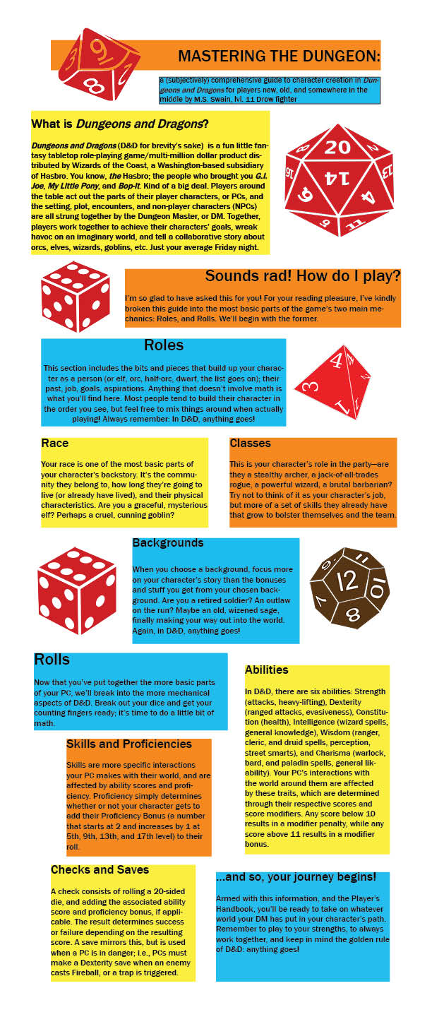
Here's what I spent some of my time working on over break--it's an infographic on character creation in the current edition of Dungeons and Dragons, and I'd like to preface your viewing with the fact that I'm...less than satisfied with it.
Here's what I spent some of my time working on over break--it's an infographic on character creation in the current edition of Dungeons and Dragons, and I'd like to preface your viewing with the fact that I'm...less than satisfied with it.
So, I'm going to start off with some positives. For one, I'm happy about the verbal part of this visual/verbal. The text, I feel, is equal parts informative and entertaining. I pride myself on being a goofball, but I'm also pretty well-informed when it comes to D&D.
Sadly, I'm not very well-informed when it comes to Adobe InDesign. For one, I think the fonts I had available didn't complement the material available. I chose the simplest one I could find, a sans-serif that wasn't too distracting from the rest. But, unfortunately, looking at it now, things just feel boring. I hoped to make things a little more interesting and engaging through the actual font, but I look at it now and I just don't feel excited. As for the visuals, I thought they looked good in place, but I'm worried that they don't seem to be useful in the context of everything else there; we vaguely know that D&D consists of rolling dice, but we don't know what these dice do, or why they're important.
That actually has given me a new idea for another infographic, one that adds a bit of practicality to some of the things I worked on in the background that didn't really get to shine. Initially, I actually put some vectors together on Photoshop that I intended to use in place of the ones there now.
 |  |
Like the infographic, they're not pretty, but I honestly would have preferred them to what I used--specifically, what you see is in place because the transparent background I put on my homemade dice didn't work when I uploaded the images to InDesign.
Back to the idea: I think I'd like to put together another infographic that defines each die, and determines for people new to the game what each die is used for (i.e. a twenty-sided die is used for skill and attack rolls, a twelve-sided die is used for greataxes and spells, a four-sided die is for daggers, etc.). Sadly, my InDesign free trial has ran out, so if I have time to put things together, I'll have to use a school computer.
I suppose that what I want readers to take away from this is that, well, design is a learning process. There will always be aspects of your projects that you're not quite happy with; we have to make compromises. And for me, I've learned that I need to own those compromises. I know that the more I use Adobe programs, the likelier I am to be satisfied with my products.
This infographic isn't a failure. It's not necessarily a success, but there are successful aspects to what I have. And I'm glad to say that, at the very least, I may have taught you a few things about D&D. Also, I hope you're interested in D&D. If not, sorry for wasting your time!
I think I'll end things on that note. Here's to the last half of my last semester!
Matt
 RSS Feed
